
All figures (15)
 Figure 10. Scatter plots of lag-1 HFS and LFS correlation versus annual precipitation P (a), mean annual temperature T (b), and De Martonne index (IDM) (c).
 Table 4. Summary of linear regression results for the LFS model. ∗ indicates a 0.1 % significance level.
 Figure 4. Spatial distribution of the lag-1 correlation coefficients for HFS (a) and LFS (b) analysis. Legend shows the colour assigned to each class of correlation for the data.
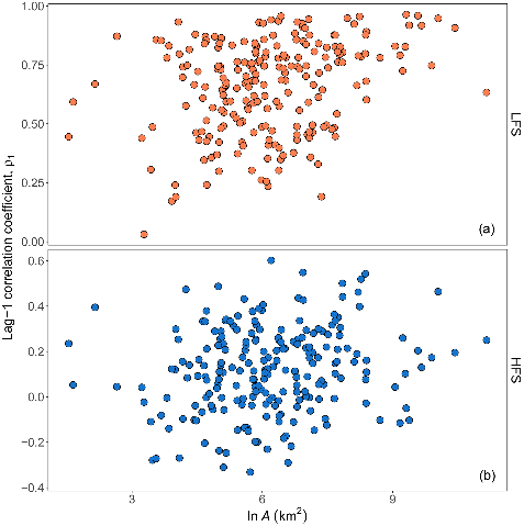 Figure 5. Scatter plots of lag-1 HFS (b) and LFS (a) streamflow correlation versus the natural logarithm of basin area ln A.
 Table 2. Differences in the mean values between the descriptors of the group 20-highest-correlation-river group for HFS and LFS versus the remaining rivers (204). NL, NG, NF, and NK columns contain the absolute number of rivers in the higher correlation group with the specific descriptor (presence of lake, glacier, flysch, and karst ), with ∗ denoting significance at 5 % significance level (two-sided test), and brackets in the body of the table containing the mean value from the 1000 resampled 20-catchment subsets.
 Table 3. Loadings of the three principal components for ln A, SR, BI, and T . The explained variance of each PC is denoted in parenthesis.
 Figure 6. Scatter plots of lag-1 HFS (bottom panels) and LFS streamflow correlation (a) versus baseflow index (BI) (a) and specific runoff (SR) (b).
 Figure 8. Digital elevation model of the Austrian river network depicting the spatial distribution of lag-1 positive correlation for HFS (a) and lag-1 positive correlation for LFS (b). Legend shows the colour assigned to each class of correlation for the data.
 Figure 9. Box plots of lag-1 correlation for Slovenian rivers with more than 50 % presence of karstic formations (PK) and rivers with no or less presence for HFS analysis (a) and LFS analysis (b). The lower and upper ends of the box represent the first and third quartiles, respectively, and the whiskers extend to the most extreme value within 1.5 IQR (interquartile range) from the box ends.
 Figure 13. Conditioning the frequency distributions for high and low flows for the Oise River. Plots of the residuals of the linear regression given by Eq. (2) for the HFS (a) and LFS (b) models. Probability distribution of the unconditioned normalized peak flows NQP (solid line) and the normalized peak flows NQP conditioned to the occurrence of the 95 % quantile (dotted line) for the HFS (c), and probability distribution of the unconditioned normalized low flows NQL (solid line) and the normalized low flows NQL conditioned to the occurrence of the 5 % quantile (dotted line) for the LFS (d). Gumbel probability plots of the return period versus the unconditioned peak flows QP (black line), and the peak flows QP modelled by the EV1 distribution and conditioned to the occurrence of the 95 % quantile (red line) for the HFS (e). Cumulative distribution function of the unconditioned low flowsQL (black line) and the low flowsQL modelled by the log-normal distribution and conditioned to the occurrence of the 5 % quantile (red line) for the LFS (f).
 Figure 12. Diagnostic plots of linear regression for the LFS model. Residuals versus the first (a), the second (b), and the third principal component (c) as well as the predicted values (d). Normal Q–Q plot of the residuals (e). Plot of the predicted values from linear regression versus the observed ones; red line is the diagonal line 1 : 1 (f).
 Figure 3. Box plots of lag-1 and lag-2 correlation coefficients for LFS analysis (orange) and the whole monthly series (white) for the 224 rivers. The lower and upper ends of the box represent the first and third quartiles, respectively, and the whiskers extend to the most extreme value within 1.5 IQR (interquartile range) from the box ends.
 Figure 2. Box plots of seasonal correlation coefficient against lag time for HFS (a) and LFS (b) analysis for the 224 rivers. The lower and upper ends of the box represent the first and third quartiles, respectively, and the whiskers extend to the most extreme value within 1.5 IQR (interquartile range) from the box ends; outliers are plotted as filled circles.
 Figure 7. Relief maps from SRTM elevation data for the HFS and LFS lag-1 correlations of the rivers. Note that elevation scale is different for each region. Legend shows the colour assigned to each class of correlation for the data.
 Figure 11. Principal component distance biplot showing the principal component scores on the first two principal axes along with the vectors (brown arrows) representing the coefficients of the baseflow index (BI), specific runoff (SR), natural logarithm of basin area ln A, and mean annual temperature T variables when projected on the principal axes. Scores for the rivers are plotted in different colours corresponding to each country of origin, and 68 % normal probability contour plots are plotted for the countries.
Theano Iliopoulou1, Cristina Aguilar2, Berit Arheimer3, María Bermúdez, Nejc Bezak4, Andrea Ficchì5, Demetris Koutsoyiannis1, Juraj Parajka6, María José Polo2, Guillaume Thirel, Alberto Montanari7 • 


