
All figures (146)

Figure 3.5: Reconstructed shower energy (top), muon momentum (middle), and muon angle (bottom) for the selected νµ charged-current events for the far detector data and MC simulation. The event selection procedure is described in Chapter 8. The MC simulation includes flux and cross-section corrections computed in Chapter 7 and corrections for the neutrino oscillations computed in Chapter 9. 
Figure 3.24: Response of the near detector to neutrino beam spills. The figures show the mean signal of detector hits with the signal below (left) and above (right) the signal threshold, as labeled on each plot. The X axis labels use “strips” to stand for hits. 
Figure 9.16: Illustrations of the statistical errors for the four sets of pseudoexperiments with several values of the number of protons on target (POT). The figures show the area contained within the 90% C.L. (see Figure 9.15) for one hundred pseudo-experiments at each fixed number of POT. The two fit methods are compared in these figures. The primary fit method is shown with a black line, labeled as “Separate.” The secondary fit method is shown with a red histogram, labeled as “All events.” 
Table 7.3: This table lists the beam configuration, the selection type, and the number of histogram bins. The table also lists the χ2 values and the number of events in the data and MC simulation, before and after the fit. This fit includes all of the Run II LE data in addition to the data from other beam configurations. 
Figure 9.4: These figures show the data spectra and the oscillated MC spectra divided by the expected MC spectra without oscillations. The top figure shows QES and RES events. The bottom figure shows the DIS events. These figures show the sum of Run I and Run II data events. 
Figure 3.18: Energy resolution for Eν (top), Eµ (middle), and Ehad (bottom). Figures (a), (c), and (e) show the energy resolution computed for the true QES, RES, and DIS events in the MC simulation. Figures (b), (d), and (f) show the energy resolution computed for the selected QES, RES, and DIS events, as discussed in the text. The selected QES, RES, and DIS categories include the contributions from the true QES, RES, and DIS events, as illustrated in Figure 3.16. 
Figure 6.6: Energy spectra for the Run I and Run II data. The target position in Run II was approximately 1 cm closer to the first horn. This shift changes focusing characteristics for the secondary pions and produces fewer neutrinos. To account for this difference in target position, separate analysis procedures were performed for the Run I and Run II data. 
Figure 4.4: Number of track scintillator planes. Figure (a) shows the reconstructed muon and non-muon tracks. Figure (b) shows the three categories of events, as discussed in the text. 
Figure 8.4: Timing of the far detector events, relative to the arrival time of the nearest beam spill. The left plot shows separately events from Run I and Run II. The right plot shows all events. Visible in the right plot is the batch structure of the primary proton beam in the Main Injector. 
Figure 9.14: Results of 600 statistically independent pseudo-experiments. Fit parameters are not constrained to the physical region, but with the requirement sin2 2θ ≤ 2. (a) the χ2 values for the data and MC without oscillations. (b) the χ2 values for the data and best oscillation fit. (c) and (d) the best fit parameters. (e) and (f) 90% C.L. statistical errors for best fit parameters. Values obtained from the fit to the real far detector data are shown with red lines. Black dotted lines show the true values of oscillation parameters used to generate the pseudo-experiments. 
Figure A.3: The Eν spectra for several values of Q 2. The X variable is constrained within this range: 0 < X < 0.13. ![Figure 2.9: Raw and calibrated mean scintillator strip signal induced by muons produced in beam neutrino interactions in the near detector. The continuous line shows the raw signal before any corrections. Open circles show the signal with corrections accounting for variations in channel gain, attenuation in optical fiber, and strip light output. The solid histogram includes additional corrections for a non-uniform response of the scintillator and WLS fiber. This figure was taken from [52].](/figures/figure-2-9-raw-and-calibrated-mean-scintillator-strip-signal-3sq590c9.png)
Figure 2.9: Raw and calibrated mean scintillator strip signal induced by muons produced in beam neutrino interactions in the near detector. The continuous line shows the raw signal before any corrections. Open circles show the signal with corrections accounting for variations in channel gain, attenuation in optical fiber, and strip light output. The solid histogram includes additional corrections for a non-uniform response of the scintillator and WLS fiber. This figure was taken from [52]. 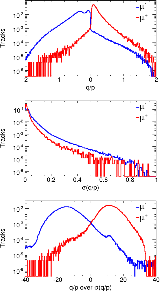
Figure 5.1: Variables computed by the track fitting algorithm are shown for the true MC µ− and µ+ tracks. The top figure shows q/p. The middle figure shows σq/p. The bottom figure shows q/p divided by σq/p. The histograms are normalized to the unit area. 
Figure 5.10: Azimuthal angle φ, the new charge-sign variable defined in Figure 5.4b, plotted after the standard (default) charge-sign selection for the µ+ and µ− tracks. Figure (a) shows the azimuthal angle for the reconstructed tracks with q/p < 0. Figure (b) shows the azimuthal angle for the reconstructed tracks with q/p > 0 
Figure 6.7: Reconstructed event energy Eν , hadronic shower energy Ehad, muon momentum Pµ and reconstructed muon angle for the selected νµ chargedcurrent events. These figures show the Run I near detector data. The right plots show the data divided by the default and tuned MC simulation. 
Figure 2.4: Reconstructed neutrino energy distributions in the MINOS near detector. The figure shows the νµ charged-current data events (discussed in Chapters 4 and 6), recorded using 3 target positions, with the target placed 10 cm, 150 cm and 250 cm away from the 1st horn (see Figure 2.3). The horns are pulsed at 185 kA or 200 kA current, producing a maximum 30 kG toroidal magnetic field. The number of events is normalized to 1018 protons on target (POT). ![Figure 2.3: Drawing of a baffle, a target, and two magnetic horns (separated by 10 m). The NuMI horns are pulsed in “forward” polarity, focusing positively charged secondary hadrons. The baffle and target can be moved together further upstream (to the left) of the horns to focus higher momentum secondary hadrons and to produce a higher energy neutrino beam (see Figure 2.4). The vertical scale is 4 times greater than the horizontal scale. This figure was taken from [58].](/figures/figure-2-3-drawing-of-a-baffle-a-target-and-two-magnetic-3eaicydm.png)
Figure 2.3: Drawing of a baffle, a target, and two magnetic horns (separated by 10 m). The NuMI horns are pulsed in “forward” polarity, focusing positively charged secondary hadrons. The baffle and target can be moved together further upstream (to the left) of the horns to focus higher momentum secondary hadrons and to produce a higher energy neutrino beam (see Figure 2.4). The vertical scale is 4 times greater than the horizontal scale. This figure was taken from [58]. ![Figure 1.4: Flux of µ+ τ neutrinos versus flux of electron neutrinos. CC, NC and ES flux measurements are indicated by the filled bands. The predicted 8B solar neutrino flux [27] is shown as dashed lines, and that measured with the NC channel is shown as the solid band parallel to the prediction. The narrow band parallel to the SNO ES result corresponds to the Super-Kamiokande result [31]. The intercepts of these bands with the axes represent the ±1σ uncertainties. The non-zero value of φµτ provides strong evidence for neutrino flavor transformation. The point represents φe from the CC flux and φµτ from the NC-CC difference with 68%, 95%, and 99% C.L. contours included. The figure and caption were taken from [32].](/figures/figure-1-4-flux-of-u-t-neutrinos-versus-flux-of-electron-2zeo2rrt.png)
Figure 1.4: Flux of µ+ τ neutrinos versus flux of electron neutrinos. CC, NC and ES flux measurements are indicated by the filled bands. The predicted 8B solar neutrino flux [27] is shown as dashed lines, and that measured with the NC channel is shown as the solid band parallel to the prediction. The narrow band parallel to the SNO ES result corresponds to the Super-Kamiokande result [31]. The intercepts of these bands with the axes represent the ±1σ uncertainties. The non-zero value of φµτ provides strong evidence for neutrino flavor transformation. The point represents φe from the CC flux and φµτ from the NC-CC difference with 68%, 95%, and 99% C.L. contours included. The figure and caption were taken from [32]. 
Figure 6.3: These figures show the ratio of the muon momentum from the range over the muon momentum from the curvature, Prange/Pcurv for the three magnetic field maps, as discussed in the text. The muon momentum from the curvature, Pcurv, is computed using the standard fitting algorithm. These figures show the tracks for the near detector data and MC simulation. The number of the data tracks is scaled down to match the number of the MC tracks. 
Figure 9.20: Systematic errors for the three sets of pseudo-experiments. Each figure shows a difference between two fit parameters. First fit parameter is obtained from a fit with a pseudo experiment without systematic effects. Second fit parameter is obtained from a fit with a pseudo experiment that includes one or more systematic shifts, as described in the text. In both cases, the same statistical pseudo experiment is used. Figures (a) and (b) show differences for the near detector systematic effects. Figures (c) and (d) show differences for the far detector correlated systematic effects. Figures (e) and (f) show differences for the far detector uncorrelated systematic effects. Blue lines mark a symmetric region that includes 68% of the pseudo-experiments. ![Table 1.1: Three generations (or flavors) of fermions in the Standard Model. The table shows the most current mass measurements and limits [5]. The quark mass measurements contain significant uncertainties because quarks are confined within hadrons, and, unlike leptons, their masses can not be measured directly. The neutrino mass limits are obtained from direct measurements. The squared neutrino mass differences are measured precisely by neutrino oscillation experiments.](/figures/table-1-1-three-generations-or-flavors-of-fermions-in-the-2yfur3kw.png)
Table 1.1: Three generations (or flavors) of fermions in the Standard Model. The table shows the most current mass measurements and limits [5]. The quark mass measurements contain significant uncertainties because quarks are confined within hadrons, and, unlike leptons, their masses can not be measured directly. The neutrino mass limits are obtained from direct measurements. The squared neutrino mass differences are measured precisely by neutrino oscillation experiments. 
Figure 4.3: This figure shows an overlap area used to optimize the selection variables, as discussed in the text. Shown are the overlap areas for combinations of parameters; each combination is used to compute the selection variables for the tracks of different lengths. Figure (a) shows the overlap areas for the signal fluctuation variable (defined in Section 4.3.3). Figure (b) shows the overlap areas for the transverse profile variable (defined in Section 4.3.4). A combination of parameters that gives the smallest overlap area for medium length (12-30 planes) tracks was selected for the analysis. 
Figure 4.2: A longitudinal track profile for muon and non-muon reconstructed tracks in the MC simulation. Figure (a) shows muon tracks, and Figure (b) shows non-muon tracks. The tracks are split into ten segments of approximately equal lengths. For each segment, the mean signal of all strips in the segment is computed. The mean signal of the segment is plotted versus the segment position along the track. The units of the Y axis are ADC counts, where 100 ADC ≈ 1 photoelectron. 
Table 7.1: Summary of the 6 parameters used to adjust the cross-section model and the detector model. The listed errors are used for a penalty term computation, as discussed in Section 7.3. The first 16 parameters, indexed from 0 through 15, are used to adjust the neutrino flux, as discussed in Section 7.1. 
Table 5.1: Number of true ν̄µ charged-current and νµ charged-current events among the selected events with the positive charge sign, as computed by the three methods. The new and improved charge sign methods significantly reduce a number of the background νµ charged-current events. 
Figure 1.2: Muon neutrino survival probability plotted as a function of neutrino energy for the MINOS 735 km baseline and the mass squared difference measured in Chapter 9. The blue line shows the probability that a muon neutrino produced at Fermilab reaches the MINOS far detector. 
Figure 5.9: Azimuthal angle φ and polar radius. These variables are defined in Figure 5.4b. Figures (a) and (b) show the muon and non-muon tracks. Figures (c) and (d) show the π− and π+ tracks. The histograms are normalized to the unit area (except for Figure (d)). The figures are made using the MC simulation of the near detector. ![Figure 2.10: Absolute scintillator strip calibration using stopping power for muons. The gray line shows the Bethe-Block calculation [5] of the stopping power for muons in polystyrene scintillator. The solid circles and open triangles show the response stopping muons in the far detector data and the GEANT Monte-Carlo simulation, respectively. Both data and simulation are scaled to match the calculation at the minimum ionizing point. This figure was taken from [52].](/figures/figure-2-10-absolute-scintillator-strip-calibration-using-d7ow36g0.png)
Figure 2.10: Absolute scintillator strip calibration using stopping power for muons. The gray line shows the Bethe-Block calculation [5] of the stopping power for muons in polystyrene scintillator. The solid circles and open triangles show the response stopping muons in the far detector data and the GEANT Monte-Carlo simulation, respectively. Both data and simulation are scaled to match the calculation at the minimum ionizing point. This figure was taken from [52]. 
Table 3.1: Fractions of the true QES, RES, and DIS events among the selected νµ charged-current events, computed with the MC simulation of neutrino interactions in the near detector using the low energy beam configuration. ![Figure 9.23: This figure shows 68% and 90% C.L. regions from the latest published result by the MINOS collaboration for the measurement of oscillation parameters [46]. The best fit parameters for the published MINOS result are: sin2 2θ > 0.90 (90% C.L.) and |∆m2| = (2.43 ± 0.13) × 10−3eV2 (68% C.L) (statical and systematic errors combined). The C.L. regions from Super-Kamiokanda [42] and K2K experiments [48] are also shown.](/figures/figure-9-23-this-figure-shows-68-and-90-c-l-regions-from-the-1g6nxt8z.png)
Figure 9.23: This figure shows 68% and 90% C.L. regions from the latest published result by the MINOS collaboration for the measurement of oscillation parameters [46]. The best fit parameters for the published MINOS result are: sin2 2θ > 0.90 (90% C.L.) and |∆m2| = (2.43 ± 0.13) × 10−3eV2 (68% C.L) (statical and systematic errors combined). The C.L. regions from Super-Kamiokanda [42] and K2K experiments [48] are also shown. ![Figure 1.7: The figure shows a ratio of the Super-Kamiokande data to the expected events without neutrino oscillations (black points) plotted as a function of L/E. L is a reconstructed distance from the detector to the point in the Earth’s atmosphere where the muon neutrino was produced. The solid black line shows the result of the two-neutrino νµ → ντ oscillations. The best-fit expectation for neutrino decay (dashed line) and neutrino decoherence (dotted line) are also shown. This figure was taken from [42].](/figures/figure-1-7-the-figure-shows-a-ratio-of-the-super-kamiokande-kiluqyaa.png)
Figure 1.7: The figure shows a ratio of the Super-Kamiokande data to the expected events without neutrino oscillations (black points) plotted as a function of L/E. L is a reconstructed distance from the detector to the point in the Earth’s atmosphere where the muon neutrino was produced. The solid black line shows the result of the two-neutrino νµ → ντ oscillations. The best-fit expectation for neutrino decay (dashed line) and neutrino decoherence (dotted line) are also shown. This figure was taken from [42]. ![Figure 1.6: Measurements of the atmospheric neutrino flavor ratio of ratios R′ from several atmospheric neutrino experiments. See References [40, 41] for a review of the experiments. This figure was taken from [41].](/figures/figure-1-6-measurements-of-the-atmospheric-neutrino-flavor-wve4v0n7.png)
Figure 1.6: Measurements of the atmospheric neutrino flavor ratio of ratios R′ from several atmospheric neutrino experiments. See References [40, 41] for a review of the experiments. This figure was taken from [41]. 
Figure 6.12: These figures show the data divided by the default and tuned MC simulation, for the reconstructed energy Eν . These figures show the Run I near detector data. The top figure shows the selected QES events. The middle figure shows the selected RES events. The bottom figure shows the selected DIS events. 
Table 9.2: Systematic errors for the oscillation parameters. The extrapolation error is obtained using 10 sets of the parameters obtained using the near detector data. The single shift error is obtained using the single ± shift for one of 6 systematic uncertainties. The multiple shifts error is obtained using the multiple ± shifts for 6 systematic uncertainties. The total error is the sum in quadratures of the three errors. 
Figure 9.7: Allowed regions of 68%, 90%, and 99% C.L in the |∆m2| and sin2 2θ plane for the primary fit of the far detector data. This fit separates νµ charged-current events into the DIS events and the combination of QES and RES events. The best fit data point is shown as a blue star: |∆m2| = 2.44 × 10⁻³eV 2 and sin2 2θ = 1. 
Figure 3.16: Reconstructed event energy for 3 categories of the selected MC νµ charged-current events. The top figure shows the selected QES events. The middle figure shows the selected RES events. The bottom figure shows the selected DIS events. In each figure, the contributions from the true QES, RES, and DIS events are shown separately. 
Figure 5.4: (a) Illustration of the charge-sign technique along the detector Z axis. A straight line along the initial track direction at the vertex, nV, is used to project the vertex point V to the point P in the last track plane. The actual track ends at the point E. (b) In the last track plane, the position of the last track hit E is shown; also shown are the projected point P, and the vertex point V. A right-handed Cartesian 2d coordinate system is constructed such that the x-axis points radially outward (parallel to the line that passes through the coil and the track vertex), and the y-axis is orthogonal to the x-axis. The center of this coordinate system is at the point P. 
Figure 4.12: Figure (a) shows the efficiency, and Figure (b) shows the purity for the νµ charged-current selection. Figure (c) shows efficiency, and Figure (d) shows purity for the ν̄µ charged-current events. Each figure includes the near detector MC events from three beam configurations. 
Figure 8.9: These figures show the selected νµ charged-current far detector events. The top figure shows the reconstructed hadronic shower energy, Ehad. The middle figure shows the reconstructed muon momentum, Pµ. The bottom figure shows the total event energy, Eν = Ehad + Eµ. 
Figure 3.19: Figure (a) shows the reconstructed energy for the true and selected (reco) QES events. Figure (b) shows the energy resolution for the true and selected (reco) QES events. The bottom two plots compare the two energy reconstruction methods, defined in Equation 3.1 (red) and Equation 3.5 (blue). Figure (c) shows the reconstructed energy for the selected QES events. Figure (d) shows the energy resolution for the selected QES events. Using Equation 3.5 significantly reduces the energy reconstruction bias. 
Figure 4.5: A mean pulse height of the track hits. Figure (a) shows the reconstructed muon and non-muon tracks. Figure (b) shows the three categories of events, as discussed in the text. 
Figure 3.10: Event display and Feynman diagram for the resonance production (RES) νµ charged-current interaction. The top two panels show the reconstructed RES event in the MC simulation of the near detector. 
Figure 9.3: These figures show the two energy spectra. The top figure shows QES and RES events combined together. The bottom figure shows the DIS events. These figures show the sum of Run I and Run II data events, the expected MC events without oscillations, and the oscillated MC events using the best fit oscillation parameters. 
Figure 9.15: Allowed regions of 90% C.L. in the |∆m2| and sin2 2θ plane for four simulated pseudo-experiments with several values of the number of protons on target (POT). These contours are obtained using the primary fit method. 
Figure A.4: The Eν spectra for several values of Q 2. The X variable is constrained within this range: 0.13 < X < 0.23. 
Figure 3.17: Purity and efficiency (defined in the text) for true QES, RES, and DIS components for the selected categories of the QES, RES, and DIS events and for all selected events. 
Table 7.2: This table lists the beam configuration, the selection type, and the number of histogram bins. The table also lists the χ2 values and the number of events in the data and MC simulation, before and after the fit. This fit includes all of the Run I LE data in addition to the data from other beam configurations. ![Figure 9.22: The latest published result by the MINOS collaboration for the measurement of oscillation parameters [46]. This figure shows the sum of the Run I and Run II events. This figure shows the data and MC simulation weighted by the best oscillation fit parameters divided the MC expectation without oscillations. These figures show the fits to the standard oscillation hypothesis and two alternative hypotheses (see Chapter 1).](/figures/figure-9-22-the-latest-published-result-by-the-minos-3hx0orlz.png)
Figure 9.22: The latest published result by the MINOS collaboration for the measurement of oscillation parameters [46]. This figure shows the sum of the Run I and Run II events. This figure shows the data and MC simulation weighted by the best oscillation fit parameters divided the MC expectation without oscillations. These figures show the fits to the standard oscillation hypothesis and two alternative hypotheses (see Chapter 1). 
Figure 3.6: This figure shows one neutrino beam spill in the near detector. All hits with pulse height greater than 40 ADC from the calorimeter section of the near detector are shown. Neutrinos are incident from the left. This spill contains multiple neutrino interactions within the detector and one rock muon entering through the front face of the detector. The hit pattern and hit times are used to reconstruct individual events. The hit pulse height is measured using ADC, where 100 ADC ≈ 1 photoelectron. ![Figure 1.3: Predicted solar neutrino energy spectrum [27].](/figures/figure-1-3-predicted-solar-neutrino-energy-spectrum-27-2wz5oazr.png)
Figure 1.3: Predicted solar neutrino energy spectrum [27]. 
Figure 4.15: The top two figures show the radius of the knn neighborhood for the near detector data and the MC simulation for the original method (top) and for the modified method (middle), as discussed in the text. The bottom figure shows the fraction of the event pulse height contained within the high pulse height hits (with a pulse height greater than 2 photoelectrons). This figure shows all reconstructed events contained within the near detector fiducial volume. The MC histograms are normalized to the number of data events. The true MC neutral-current events are shown in light purple. 
Figure 6.4: These figures show the ratio of the muon momentum from the range over the muon momentum from the curvature, Prange/Pcurv for the three magnetic field maps, as discussed in the text. The muon momentum from the curvature, Pcurv, is computed using the alternative fitting algorithm. These figures show the tracks for the near detector data and MC simulation. The number of the data tracks is scaled down to match the number of the MC tracks. ![Figure 1.8: A three-neutrino squared-mass spectrum that accounts for the observed flavor changes of solar, reactor, atmospheric, and long-baseline accelerator neutrinos. The figures shows the normal and inverted mass hierarchies. The νe fraction in the ν3 mass eigenstate shows the best experimental limit. The plot was taken from [51].](/figures/figure-1-8-a-three-neutrino-squared-mass-spectrum-that-1iwckjwx.png)
Figure 1.8: A three-neutrino squared-mass spectrum that accounts for the observed flavor changes of solar, reactor, atmospheric, and long-baseline accelerator neutrinos. The figures shows the normal and inverted mass hierarchies. The νe fraction in the ν3 mass eigenstate shows the best experimental limit. The plot was taken from [51]. 
Figure 3.2: Reconstructed vertex positions for the selected νµ charged-current events for the near detector data and MC simulation. The event selection procedure is described in Chapter 6. The MC simulation includes both flux and cross-section corrections computed in Chapter 7. The data events were recorded in the Run I period, as described in Section 6.3. 
Figure 3.21: Response of the near detector to neutrino beam spills. The figures show the number of channels in a spill that have 1, 2, 3, 4, 5, 6, 7, or 8 or more hits within a single spill. The multiple hits in the same channel are separated in time. ![Figure 7.1: Scatter plots of pT versus pz momentum components for the parent pions that produce neutrinos at the near detector, as calculated by FLUKA05. The left plots show the contributions to the near detector νµ spectra from π + decays. The right plots show the contributions to the near detector ν̄µ spectra from π− decays. These figures were taken from [63].](/figures/figure-7-1-scatter-plots-of-pt-versus-pz-momentum-components-3uynp45g.png)
Figure 7.1: Scatter plots of pT versus pz momentum components for the parent pions that produce neutrinos at the near detector, as calculated by FLUKA05. The left plots show the contributions to the near detector νµ spectra from π + decays. The right plots show the contributions to the near detector ν̄µ spectra from π− decays. These figures were taken from [63]. 
Table 6.1: Selection criteria for the five categories of events used in our analysis of the near and far detector data: νµ charged-current, ν̄µ charged-current, and νµ charged-current QES, RES, and DIS events. The charge sign variables q/p 
Figure 4.1: Event displays show two reconstructed events from the MC simulation. The left figure shows a true νµ charged-current event, and the right figure shows a true neutral-current event. The reconstructed track hits are shown in red; the reconstructed shower hits are shown in green. For this νµ charged-current event, the (green) shower hits obscure the beginning (vertex) of the track. The track is split into two segments, outlined by the blue boxes, and only the strips from the second (right) segment are used to construct the variables defined in Section 4.3. 
Figure 9.19: Results of 6400 independent pseudo-experiments for the correlated far detector systematic errors, as discussed in the text. (a) the χ2 values for the data and MC without oscillations. (b) the χ2 values for the data and best oscillation fit MC. (c) and (d) the best fit oscillation parameters. (e) and (f) 90% C.L. statistical errors for the best fit parameters. Red lines show the values obtained from the oscillation fit to the real far detector data. 
Figure 8.10: These figures show the selected νµ charged-current far detector events. The top figure shows the reconstructed inelasticity parameter, Y. The middle figure shows the reconstructed momentum transfer, Q2. The bottom figure shows the reconstructed invariant mass squared, W 2. These variables are defined in Section 3.3. 
Figure 4.10: k-nearest neighbor variable for tracks and events. The variables are computed using the 80 nearest neighbors. Figure (a) shows the reconstructed muon and non-muon tracks. Figure (b) shows the three categories of events, as discussed in Section 4.3. 
Figure 2.2: Number of protons on a target (POT) delivered to the NuMI target. The solid green histogram (using the left vertical axis) shows an average number of POT per week plotted versus time. The blue line (using the right vertical axis) shows an integrated number of POT. The thesis analysis uses the near detector data recorded between May, 2005 and July, 2007. 
Figure 4.13: Four muon identification variables shown for the near detector data and MC tracks with the original method (left) and the modified method (right), as discussed in the text. The left plots use all near detector strips. The right plots use the calorimeter strips with a pulse height greater than 0.3 mip (approximately 1.8 photoelectrons). The MC histograms (labeled as “Siml.”) are normalized to the number of data events. The true MC neutral-current events are shown in light purple. 
Figure 3.9: Event display and Feynman diagram for the quasielastic scattering (QES) νµ charged-current interaction. The top two panels show the reconstructed QES event in the MC simulation of the near detector. 
Table 9.1: Best fit oscillation parameters for 6 fit combinations. The primary method separates νµ charged-current events into QES and RES events and DIS events. The secondary (2nd) method uses all νµ charged-current events. The oscillation parameters are shown for the separate fits to the Run I events and the Run II events and the simultaneous fits for the Run I and Run II events. For |∆m2|, statistical errors are determined as the largest deviation on the left and right sides from the best fit value for 68% C.L. interval. χ2init is the χ2 value for the data and MC prediction without oscillations. χ2best is the χ2 value for the data and MC weighted by best fit oscillations parameters. 
Figure 9.11: Results of 600 statistically independent pseudo-experiments. (a) number of data events in a pseudo experiment. (b) number of events in a best fit MC simulation, where fit parameters are constrained to the physical region: sin2 2θ ≤ 1. Values obtained from the fit to the far detector data are shown as red lines. 
Table 7.4: Best fit parameters for the Run I and Run II fits using the data listed in Tables 7.2 and 7.3. The parameters are defined in Table 7.1 and in Equations 7.7 and 7.8. 
Figure 6.5: Ratio of the muon momentum from the range over the muon momentum from the curvature using the new magnetic field map for the data (top) and the MC (bottom) muon tracks in the near detector. The ratios are fitted with a Gaussian function within a range marked by green lines, located at 60% of the peak value. The difference between the Gaussian means for the data and the MC simulation is approximately 1%. 
Figure 1.9: Allowed region for the neutrino oscillation parameters from the KamLAND and solar neutrino experiments. The side-panels show the ∆χ2profiles for KamLAND (dashed) and solar experiments (dotted) individually, as well as the combination of the two (solid). 
Figure 5.6: Projections onto the y axis (left) and x axis (right) of the scatter plots in Figure 5.5. These figures show the projections of the distance PE onto the x-axis and y-axis, defined in Figure 5.4b. The histograms are normalized to the unit area. The figures show the µ− and µ+ tracks from the MC simulation of the near detector. 
Figure 5.5: Differences between actual and projected muon trajectories. The figures show positions of the point E relative the point P, using the coordinate system defined in Figure 5.4b. The left figure shows the µ− tracks, and the right figure shows µ+ tracks using the MC simulation of the near detector. ![Figure 2.5: The left panels show contributions to the near detector νµ chargedcurrent spectrum from π+ and K+ parents. The right panels show contributions to the near detector ν̄µ charged-current spectrum from π − and K− parents. The plots were taken from [63].](/figures/figure-2-5-the-left-panels-show-contributions-to-the-near-3rnb7nbi.png)
Figure 2.5: The left panels show contributions to the near detector νµ chargedcurrent spectrum from π+ and K+ parents. The right panels show contributions to the near detector ν̄µ charged-current spectrum from π − and K− parents. The plots were taken from [63]. 
Figure 6.1: The left figure shows the muon momentum measured via range, for the tracks that stop within the near detector detector. The right figure shows the muon momentum measured via curvature, for the tracks that exit the near detector detector. These figures show the near detector events for the data and two versions of the MC simulation, described in Section 6.3. The MC histograms are scaled to the number of POT in the data. 
Figure 6.13: Reconstructed energy Eν for the selected QES, RES, and DIS events. These figures show the Run II near detector data. The top figure shows the selected QES events. The middle figure shows the selected RES events. The bottom figure shows the selected DIS events. 
Figure 5.7: Figures show the azimuthal angle (left) and the polar radius PE (right), defined in Figure 5.4b. The histograms are normalized to the unit area. The figures show µ− and µ+ tracks from the MC simulation of the near detector. 
Figure 6.9: Reconstructed W 2, X, Y , and Q2 distributions for the selected νµ charged-current events. These figures show the Run I near detector data. The right plots show the data divided by the default and tuned MC simulation. 
Figure 4.6: Figure (a) shows a mean of the low pulse height hits. Figure (b) shows a mean of the high pulse height hits. 
Figure 7.3: The weight of the π+ and π− neutrino parents is plotted as a function of the pT and pz momentum components. These figures show the weights obtained with the best fit parameters from Table 7.4. The left (right) figures show weights for the Run I (Run II) fit. ![Figure 9.21: The latest published result by the MINOS collaboration for the measurement of oscillation parameters [46]. This figure shows the reconstructed energy spectra for the sum of the Run I and Run II events. Shown are the data events, the MC events without oscillations, and the MC events weighted by the best oscillation fit parameters.](/figures/figure-9-21-the-latest-published-result-by-the-minos-vix12ot8.png)
Figure 9.21: The latest published result by the MINOS collaboration for the measurement of oscillation parameters [46]. This figure shows the reconstructed energy spectra for the sum of the Run I and Run II events. Shown are the data events, the MC events without oscillations, and the MC events weighted by the best oscillation fit parameters. ![Figure 1.5: Ratio of the background subtracted electron anti-neutrino spectrum measured by KamLAND to the expectation for no-oscillation as a function of L/E. L is the effective baseline taken as a flux-weighted average (L=180km). The expected spectrum accounts for the distances to the individual reactors, time-dependent flux variations, and efficiencies. This figure was taken from [36].](/figures/figure-1-5-ratio-of-the-background-subtracted-electron-anti-3c2ink8b.png)
Figure 1.5: Ratio of the background subtracted electron anti-neutrino spectrum measured by KamLAND to the expectation for no-oscillation as a function of L/E. L is the effective baseline taken as a flux-weighted average (L=180km). The expected spectrum accounts for the distances to the individual reactors, time-dependent flux variations, and efficiencies. This figure was taken from [36]. ![Figure 3.7: A mean number of near detector events per near detector beam spill plotted as a function of the number of protons on target (POT). The plot was taken from [58].](/figures/figure-3-7-a-mean-number-of-near-detector-events-per-near-2bd73esc.png)
Figure 3.7: A mean number of near detector events per near detector beam spill plotted as a function of the number of protons on target (POT). The plot was taken from [58]. 
Figure 1.1: Feynman diagrams for charged-current and neutral current interactions of neutrinos. Neutrinos interact with quarks bound within protons and neutrons which form nuclei. Neutrinos can be distinguished by flavor of associated charged lepton (electron, muon or tau) in the charged current interactions. 
Figure 5.2: Near detector (top) and far detector (bottom) magnetic field maps. The two detectors have toroidal magnetic field geometry with an average field strength of around 1.2 T. Black arrows indicate the direction of the magnetic field lines. Figures are courtesy of Robert Hatcher. ![Figure 2.7: A cutaway drawing of a MINOS scintillator strip. Scintillation light is produced by an ionizing particle and is multiply reflected inside the strip by a 0.25 mm thick outer reflective layer (shown in the cross-section view). Light is absorbed by a wavelength shifting (WLS) fiber and is reemitted isotropically. The re-emitted photons, whose directions fall within the total internal reflection cones, are transported along the fiber to the strip’s edges and routed to the photomultiplier tubes via clear fiber (see Figure 2.8). This figure was taken from [52].](/figures/figure-2-7-a-cutaway-drawing-of-a-minos-scintillator-strip-1i2z3yyv.png)
Figure 2.7: A cutaway drawing of a MINOS scintillator strip. Scintillation light is produced by an ionizing particle and is multiply reflected inside the strip by a 0.25 mm thick outer reflective layer (shown in the cross-section view). Light is absorbed by a wavelength shifting (WLS) fiber and is reemitted isotropically. The re-emitted photons, whose directions fall within the total internal reflection cones, are transported along the fiber to the strip’s edges and routed to the photomultiplier tubes via clear fiber (see Figure 2.8). This figure was taken from [52]. 
Figure 9.6: These figures show the data spectra and the oscillated MC spectra divided by the MC spectra without oscillations. The top figure shows Run I events. The middle figure shows Run II events. The bottom figure shows the sum of Run I and Run II events. 
Figure 6.14: These figures show the data divided by the default and tuned MC simulation, for the reconstructed energy Eν . These figures show the Run II near detector data. The top figure shows the selected QES events. The middle figure shows the selected RES events. The bottom figure shows the selected DIS events. 
Figure 8.8: These figures show the selected νµ charged-current far detector events. The top figure shows a number of event scintillator planes. The middle figure shows event pulse height, measured in the ADC units, where 100 ADC ≈ 1 photoelectron. The bottom figure shows the event pulse height divided by the number of event scintillator strips. ![Figure 8.6: The top four figures show the four input variables used for the muon identification. The bottom figure shows the event classification parameter. The data events are compared to the MC events in absence of oscillations and the MC events with generic oscillation parameters. Both versions of the MC simulation are adjusted using the near detector data and the matrix method [46]. 212](/figures/figure-8-6-the-top-four-figures-show-the-four-input-3laf8qv4.png)
Figure 8.6: The top four figures show the four input variables used for the muon identification. The bottom figure shows the event classification parameter. The data events are compared to the MC events in absence of oscillations and the MC events with generic oscillation parameters. Both versions of the MC simulation are adjusted using the near detector data and the matrix method [46]. 212 ![Figure 3.14: Feynman diagram of νµ charged-current interaction with nucleon. Three detector observables are measured for every reconstructed event: energy of final-state hadronic system (hadronic shower energy) Ehad, muon energy Eµ, and muon angle θµ with respect to the initial neutrino direction. Here, k1 is the four-momentum of incoming neutrino, p is the four-momentum of target nucleon, k2 is the four-momentum of outgoing muon, and q is the fourmomentum of W + boson. The figure was taken from [80].](/figures/figure-3-14-feynman-diagram-of-nu-charged-current-dinyuwqq.png)
Figure 3.14: Feynman diagram of νµ charged-current interaction with nucleon. Three detector observables are measured for every reconstructed event: energy of final-state hadronic system (hadronic shower energy) Ehad, muon energy Eµ, and muon angle θµ with respect to the initial neutrino direction. Here, k1 is the four-momentum of incoming neutrino, p is the four-momentum of target nucleon, k2 is the four-momentum of outgoing muon, and q is the fourmomentum of W + boson. The figure was taken from [80]. 
Figure 9.12: Allowed regions of 68%, 90%, and 99% C.L in the |∆m2| and sin2 2θ plane for the primary fit method. The best fit data point is shown as a blue star: |∆m2| = 2.44 × 10⁻³eV 2 and sin2 2θ = 1. Best fit points for the 600 statistically independent pseudo-experiments are shown as black points. 
Figure A.5: The Eν spectra for different values of Q 2. The X variable is constrained within this range: 0.23 < X < 0.35. 
Table 7.5: Best fit parameters for the Run I data obtained using the current and previous versions of the MC simulation and event reconstruction software. For clarity of presentation, only 6 parameters are shown. These parameters adjust the cross-section and reconstructed energy scales. ![Figure 8.1: Figure (a) illustrates the differences between the near and far detectors for the νµ charged-current interaction rates at the two detectors. These differences are due to the angular acceptance effects and the distances between the decay point to the two detectors. Figure (b) shows the join distribution of neutrino energies observed in the near and far detectors. The content of each cell represents the mean number of νµ charged-current events expected at the far detector for one νµ charged-current event in the near detector. These figures were taken from [58].](/figures/figure-8-1-figure-a-illustrates-the-differences-between-the-39hv6lih.png)
Figure 8.1: Figure (a) illustrates the differences between the near and far detectors for the νµ charged-current interaction rates at the two detectors. These differences are due to the angular acceptance effects and the distances between the decay point to the two detectors. Figure (b) shows the join distribution of neutrino energies observed in the near and far detectors. The content of each cell represents the mean number of νµ charged-current events expected at the far detector for one νµ charged-current event in the near detector. These figures were taken from [58]. 
Figure 3.3: Reconstructed vertex positions for the selected νµ charged-current events for the far detector data and MC simulation. The event selection procedure is described in Chapter 8. The MC simulation includes flux and crosssection corrections computed in Chapter 7 and corrections for the neutrino oscillations computed in Chapter 9. 
Figure 9.9: Allowed regions of 68% C.L in the |∆m2| and sin2 2θ plane for the primary fits of the far detector data. One fit uses the standard energy reconstruction formula and another fit uses the kinematic formula for the selected QES events. Both fits are constrained to the physical region. 
Figure 5.12: Reconstructed energy for the near detector events that pass one of three positive charge-sign selections described in the text: default, new, and improved. Figure (a) shows the true νµ charged-current interactions. Figure (b) shows the true ν̄µ charged-current interactions. 
Figure 7.2: These figures show the χ2 function plotted as the function of the energy scale and QES event normalization parameters. The left plot uses the QES energy scale parameter. The right plot uses the QES event normalization parameter. The χ2 function shown in the red line uses the kernel smoothing method, as discussed in the text. 
Table 4.1: Number of the near detector data and MC events selected and rejected by the original and modified methods, as discussed in the text. 
Figure A.1: The Eν spectra for several values of Q 2. 
Figure 9.10: Allowed regions of 68% C.L in the |∆m2| and sin2 2θ plane for the primary fits of the far detector data. One fit uses the standard energy reconstruction formula and another uses the kinematic formula for the selected QES events. Both fits are not constrained to the physical region. 
Figure 3.13: Reconstructed event energy for the true QES, RES, and DIS events among the selected MC νµ charged-current events. ![Figure 1.10: Figure shows 68% and 90% C.L. regions from the MINOS, SuperKamiokande, and K2K experiments for the measurement of oscillation parameters [46]. The best fit parameters for the published MINOS result are: sin2 2θ > 0.90 (90% C.L.) and |∆m2| = (2.43 ± 0.13) × 10−3eV2 (68% C.L) (statical and systematic errors combined).](/figures/figure-1-10-figure-shows-68-and-90-c-l-regions-from-the-9fghbzna.png)
Figure 1.10: Figure shows 68% and 90% C.L. regions from the MINOS, SuperKamiokande, and K2K experiments for the measurement of oscillation parameters [46]. The best fit parameters for the published MINOS result are: sin2 2θ > 0.90 (90% C.L.) and |∆m2| = (2.43 ± 0.13) × 10−3eV2 (68% C.L) (statical and systematic errors combined). 
Figure 9.18: Results of 1200 independent pseudo-experiments for the uncorrelated far detector systematic errors, as discussed in the text. (a) the χ2 values for the data and MC without oscillations. (b) the χ2 values for the data and best oscillation fit MC. (c) and (d) the best fit oscillation parameters. (e) and (f) 90% C.L. statistical errors for the best fit parameters. Red lines show the values obtained from the oscillation fit to the real far detector data. 
Table 7.6: Best fit parameters for the Run I data. EQES column uses the EQES formula from Equation 3.5 to reconstruct energy for the selected QES events. Emu column uses the Eν formula from Equation 3.1 to reconstruct energy for the selected QES events. 
Figure 5.8: Azimuthal angle φ (defined in the text) plotted versus the ratio of q/p 
Table 3.2: Summary of the data (MC) spills recorded (simulated) with the target placed in the low energy target position. 
Figure 3.20: A number of protons delivered to (simulated with) the NuMI target for the data (MC) spills. ![Figure 2.8: A schematic drawing of the optical readout for MINOS scintillator strips. The edges of two steel planes are on the right side of the drawing, showing several scintillator strips extending beyond the edges of the steel planes for clarity. Scintillation light is produced in a strip (see Figure 2.7) and travels out of the strip via WLS fiber. The WLS fiber is connected to a clear optical fiber, assembled into an optical cable and passing through two connectors, which guides the light to a photomultiplier tube. This figure was taken from [52].](/figures/figure-2-8-a-schematic-drawing-of-the-optical-readout-for-17ut1lzm.png)
Figure 2.8: A schematic drawing of the optical readout for MINOS scintillator strips. The edges of two steel planes are on the right side of the drawing, showing several scintillator strips extending beyond the edges of the steel planes for clarity. Scintillation light is produced in a strip (see Figure 2.7) and travels out of the strip via WLS fiber. The WLS fiber is connected to a clear optical fiber, assembled into an optical cable and passing through two connectors, which guides the light to a photomultiplier tube. This figure was taken from [52]. 
Figure 6.10: Reconstructed W 2, X, Y , and Q2 distributions for the selected νµ charged-current events. These figures show the Run II near detector data. The right plots show the data divided by the default and tuned MC simulation. 
Figure 6.15: Reconstructed energy Eν for the νµ charged-current events. These figures show the Run I near detector data. Four different beam configurations are shown, as labeled on the figures. The right plots show the data divided by the default and tuned MC simulation. 
Figure 5.11: Reconstructed energy for the near detector events that pass one of three negative charge-sign selections described in the text: default, new, and improved. Figure (a) shows the true νµ charged-current interactions. Figure (b) shows the true ν̄µ charged-current interactions. 
Figure 6.8: Reconstructed event energy Eν , hadronic shower energy Ehad, muon momentum Pµ and reconstructed muon angle for the selected νµ chargedcurrent events. These figures show the Run II near detector data. The right plots show the data divided by the default and tuned MC simulation. 
Figure 9.1: These figures show the two energy spectra used for the far detector oscillation fits. The top figure shows QES and RES events combined together. The bottom figure shows the DIS events. These figures show the Run I data events, the expected MC events without oscillations, and the oscillated MC events using the best fit oscillation parameters. 
Figure 3.22: Response of the near detector to neutrino beam spills. Figure (a) shows the number of all active channels. Figure (b) shows the number of channels with 8 or more hits in a single spill. Figure (c) shows the mean signal of all active channels. Figure (d) shows the mean signal of channels with 8 or more hits in a single spill. The MC histograms are normalized to the number of POT in the data. 
Figure 8.5: The left plots shows both the number of the far detector events and the number of the accumulated protons on target as a function of time. The right plots shows the number of the far detector events per 1017 protons as a function of time. ![Figure 2.1: Schematic view of the NuMI neutrino beam facility. A proton beam is extracted from the Main Injector and is directed onto a graphite target. Secondary pions and kaons are focused by magnetic horns (Figure 2.3) into a decay volume. Ionization chambers, placed in front of hadron absorber and in muon alcoves, measure the flux of secondary hadrons and tertiary muons. This figure was taken from [58].](/figures/figure-2-1-schematic-view-of-the-numi-neutrino-beam-facility-yceif3sa.png)
Figure 2.1: Schematic view of the NuMI neutrino beam facility. A proton beam is extracted from the Main Injector and is directed onto a graphite target. Secondary pions and kaons are focused by magnetic horns (Figure 2.3) into a decay volume. Ionization chambers, placed in front of hadron absorber and in muon alcoves, measure the flux of secondary hadrons and tertiary muons. This figure was taken from [58]. 
Table 6.2: This table shows the beam configurations used for the analysis and the number of protons on target (POT) for the data and MC simulation. 
Figure 3.11: Event display and Feynman diagram for the deep inelastic scattering (DIS) νµ charged-current interaction. The filled circle represents the internal proton structure which is described by the parton and gluon structure functions. The top two panels show the reconstructed DIS event in the MC simulation of the near detector. 
Figure 5.3: Figures show y and x track-end positions for the true µ− tracks (left) and µ+ tracks (right) for the MC simulation of the near detector. 
Figure 4.7: A signal fluctuation variable is the ratio of the mean of low pulse height hits over the mean of high pulse height hits. Figure (a) shows the reconstructed muon and non-muon tracks. Figure (b) shows the three categories of events, as discussed in the text. ![Figure 2.11: MINOS calorimetric response to pions and electrons at a three particle momenta. The calorimeter signal is measured in arbitrary units. The data (open symbols), obtained from the exposure of the calibration detector to CERN test beams, are compared with the Monte-Carlo simulation. This figure was taken from [52].](/figures/figure-2-11-minos-calorimetric-response-to-pions-and-363dnhw2.png)
Figure 2.11: MINOS calorimetric response to pions and electrons at a three particle momenta. The calorimeter signal is measured in arbitrary units. The data (open symbols), obtained from the exposure of the calibration detector to CERN test beams, are compared with the Monte-Carlo simulation. This figure was taken from [52]. 
Figure 9.5: These figures show the data events, the expected MC events without oscillations, and the oscillated MC events using the best fit oscillation parameters. The top figure shows the Run I events. The middle figure shows the Run II events. These top two figures show the reconstructed energy spectra used for the oscillation fit. The bottom figure shows the sum of Run I and Run II events. 228 
Figure 9.13: Results of 600 statistically independent pseudo-experiments. Fit parameters are constrained to the physical region: sin2 2θ ≤ 1. (a) the χ2 values for the data and MC without oscillations. (b) the χ2 values for the data and the best oscillation fit MC. (c) and (d) the best fit parameters. (e) and (f) 90% C.L. statistical errors for the best fit parameters. Values obtained from the fit to the real far detector data are shown as red lines; these values were used to generate the pseudo-experiments. 
Figure A.6: The Eν spectra for different values of Q 2. The X variable is constrained within this range: 0.36 < X < 0.6. ![Figure 9.24: This figure shows 90% C.L. regions for the analysis presented in this thesis and the published MINOS results [46]. The best fit parameters for the published MINOS result are: sin2 2θ > 0.90 (90% C.L.) and |∆m2| = (2.43 ± 0.13) × 10−3eV2 (68% C.L) (statical and systematic errors combined) The best fit oscillation parameters for the thesis are: sin2 2θ > 0.96 (68% C.L.) and |∆m2| = (2.44± 0.12)× 10−3eV2 (68% C.L) (statistical errors only). The MINOS contour was obtained using the fit that includes the oscillation parameters as well as the systematic uncertainties, included as nuisance parameters.](/figures/figure-9-24-this-figure-shows-90-c-l-regions-for-the-eeegapqa.png)
Figure 9.24: This figure shows 90% C.L. regions for the analysis presented in this thesis and the published MINOS results [46]. The best fit parameters for the published MINOS result are: sin2 2θ > 0.90 (90% C.L.) and |∆m2| = (2.43 ± 0.13) × 10−3eV2 (68% C.L) (statical and systematic errors combined) The best fit oscillation parameters for the thesis are: sin2 2θ > 0.96 (68% C.L.) and |∆m2| = (2.44± 0.12)× 10−3eV2 (68% C.L) (statistical errors only). The MINOS contour was obtained using the fit that includes the oscillation parameters as well as the systematic uncertainties, included as nuisance parameters. 
Figure 6.16: Reconstructed energy Eν for the νµ charged-current events. These figures show the Run II near detector data. Three different beam configurations are shown, as labeled on the figures. The right plots show the data divided by the default and tuned MC simulation. 
Figure A.7: The Eν spectra for different values of Q 2. The X variable is constrained within this range: X > 0.6. 
Figure 9.8: Allowed regions of 68% C.L in the |∆m2| and sin2 2θ plane for two fits of the far detector data. The region marked with a black line is obtained from the secondary fit. The region marked with a red line is obtained from the primary fit. Both fits are constrained to the physical region. 
Figure 4.9: Examples of knn classification for two variables. Signal events are shown in green; background events are shown in red; and a query event is shown in black. A neighborhood enclosing the 20 nearest neighbors is shown in blue. Top: the neighborhood contains 19 green points and 1 red point - the query event is classified as a signal event. Bottom: the neighborhood contains 7 green points and 13 red points - the query event is classified as a background event. 
Figure 4.14: A discriminant variable shown for the near detector data and MC simulation. Figures (a) and (b) use all detector strips (original method). Figures (c) and (d) use strips from the calorimeter section with a pulse height greater than 0.3 mip (modified method). The MC histograms are normalized to the number of data events. The true MC neutral-current events are shown in light purple. 
Figure A.2: The Eν spectra for several values of X. 
Figure 3.12: Reconstructed quantities for the true QES, RES, and DIS events among the selected MC νµ charged-current events. The top figure shows the reconstructed muon momentum. The middle figure shows the reconstructed shower energy. The bottom figure shows the reconstructed muon track angle. 
Figure 4.11: A background rejection is plotted versus a signal acceptance for k = 20, 60, 100. Figure (a) shows the signal acceptance of the νµ charged-current events with a reconstructed track that matches a true muon. Figure (b) shows the signal acceptance of all the νµ charged-current events. The νµ chargedcurrent events are selected using a charge-sign variable, defined in Chapter 5. ![Figure 2.6: (a) A view of the MINOS near detector looking toward Soudan. (b) A view of the MINOS far detector looking toward Fermilab. These two images are courtesy of the Fermilab Visual Media Services. (c) A schematic drawing of the MINOS near detector. (d) A schematic drawing of the MINOS far detector. The far detector consists of two functionally identical modules, only one of the modules is shown in the figure. The drawings were taken from [58].](/figures/figure-2-6-a-a-view-of-the-minos-near-detector-looking-268xdi0k.png)
Figure 2.6: (a) A view of the MINOS near detector looking toward Soudan. (b) A view of the MINOS far detector looking toward Fermilab. These two images are courtesy of the Fermilab Visual Media Services. (c) A schematic drawing of the MINOS near detector. (d) A schematic drawing of the MINOS far detector. The far detector consists of two functionally identical modules, only one of the modules is shown in the figure. The drawings were taken from [58]. 
Figure 6.2: Mean of the ratio of the muon momentum from range over the momentum from the curvature plotted a function of the magnetic field scale, for the three scale factors: 1, 1.08, and 1.13. The mean is determined using Gaussian fit, similarly to the fit shown in Figure 6.5. The near detector muon tracks were used to make this figure. 
Figure 3.4: Reconstructed shower energy (top), muon momentum (middle), and muon angle (bottom) for the selected νµ charged-current events for the near detector data and MC simulation. The event selection procedure is described in Chapter 6. The MC simulation includes flux and cross-section corrections computed in Chapter 7. The data events were recorded in the Run I period, as described in Section 6.3. 
Figure 3.1: Examples of νµ charged-current (left), neutral-current (center) and νe charged-current (right) interactions in the MINOS detectors obtained from the MC simulation. The figures are courtesy of Patricia Vahle. 
Figure 6.11: Reconstructed energy Eν for the selected QES, RES, and DIS events. These figures show the Run I near detector data. The top figure shows the selected QES events. The middle figure shows the selected RES events. The bottom figure shows the selected DIS events. 
Figure 9.17: Results of 6600 independent pseudo-experiments for the extrapolation systematic errors, as discussed in the text. (a) the χ2 values for the data and MC without oscillations. (b) the χ2 values for the data and best oscillation fit MC. (c) and (d) the best fit oscillation parameters. (e) and (f) 90% C.L. statistical errors for the best fit parameters. Red lines show the values obtained from the oscillation fit to the real far detector data. 
Figure 4.8: A transverse profile variable. Figure (a) shows the reconstructed muon and non-muon tracks. Figure (b) shows the three categories of events, as discussed in the text. 
Figure 3.15: Reconstructed W 2 and Q2 variables for the true QES, RES, and DIS events. The top and middle figures show all selected MC νµ chargedcurrent events. The bottom figure shows the events with Ehad > 150MeV . 
Figure 8.2: These figures show MC events from the near and far detectors, normalized by the number of POT and the fiducial mass. These figures show the spectrum for the default (a) and tuned (b) MC simulations. Figure (c) shows the ratio of the far over near detector events (×1.4 ·10−6) for the default and tuned MC simulation. Figure (d) shows the ratio of the two histograms from Figure (c). ![Figure 8.3: Predicted MC events at the far detector. This figure compares the present analysis (MC v1) and the recent MINOS analysis [46] (MC v2) using the identically selected νµ charged-current events.](/figures/figure-8-3-predicted-mc-events-at-the-far-detector-this-24dxfxdr.png)
Figure 8.3: Predicted MC events at the far detector. This figure compares the present analysis (MC v1) and the recent MINOS analysis [46] (MC v2) using the identically selected νµ charged-current events. 
Figure 8.7: These figures show the positions of the track vertex and track end for the selected νµ charged-current far detector events. The data events are compared to the predicted MC events (no oscillations) and the oscillated MC events, as discussed in the text. 
Figure 9.2: These figures show the two energy spectra used for the far detector oscillation fits. The top figure shows QES and RES events combined together. The bottom figure shows the DIS events. These figures show the Run II data events, the expected MC events without oscillations, and the oscillated MC events using the best fit oscillation parameters. 
Figure 3.23: Response of the near detector to neutrino beam spills. The figures show the number of detector hits below (left) and above (right) the signal threshold, as labeled on each plot. The X axis labels use “strips” to stand for hits.


![Figure 2.9: Raw and calibrated mean scintillator strip signal induced by muons produced in beam neutrino interactions in the near detector. The continuous line shows the raw signal before any corrections. Open circles show the signal with corrections accounting for variations in channel gain, attenuation in optical fiber, and strip light output. The solid histogram includes additional corrections for a non-uniform response of the scintillator and WLS fiber. This figure was taken from [52].](/figures/figure-2-9-raw-and-calibrated-mean-scintillator-strip-signal-3sq590c9.webp)


![Figure 2.3: Drawing of a baffle, a target, and two magnetic horns (separated by 10 m). The NuMI horns are pulsed in “forward” polarity, focusing positively charged secondary hadrons. The baffle and target can be moved together further upstream (to the left) of the horns to focus higher momentum secondary hadrons and to produce a higher energy neutrino beam (see Figure 2.4). The vertical scale is 4 times greater than the horizontal scale. This figure was taken from [58].](/figures/figure-2-3-drawing-of-a-baffle-a-target-and-two-magnetic-3eaicydm.webp)
![Figure 1.4: Flux of µ+ τ neutrinos versus flux of electron neutrinos. CC, NC and ES flux measurements are indicated by the filled bands. The predicted 8B solar neutrino flux [27] is shown as dashed lines, and that measured with the NC channel is shown as the solid band parallel to the prediction. The narrow band parallel to the SNO ES result corresponds to the Super-Kamiokande result [31]. The intercepts of these bands with the axes represent the ±1σ uncertainties. The non-zero value of φµτ provides strong evidence for neutrino flavor transformation. The point represents φe from the CC flux and φµτ from the NC-CC difference with 68%, 95%, and 99% C.L. contours included. The figure and caption were taken from [32].](/figures/figure-1-4-flux-of-u-t-neutrinos-versus-flux-of-electron-2zeo2rrt.webp)


![Table 1.1: Three generations (or flavors) of fermions in the Standard Model. The table shows the most current mass measurements and limits [5]. The quark mass measurements contain significant uncertainties because quarks are confined within hadrons, and, unlike leptons, their masses can not be measured directly. The neutrino mass limits are obtained from direct measurements. The squared neutrino mass differences are measured precisely by neutrino oscillation experiments.](/figures/table-1-1-three-generations-or-flavors-of-fermions-in-the-2yfur3kw.webp)


![Figure 2.10: Absolute scintillator strip calibration using stopping power for muons. The gray line shows the Bethe-Block calculation [5] of the stopping power for muons in polystyrene scintillator. The solid circles and open triangles show the response stopping muons in the far detector data and the GEANT Monte-Carlo simulation, respectively. Both data and simulation are scaled to match the calculation at the minimum ionizing point. This figure was taken from [52].](/figures/figure-2-10-absolute-scintillator-strip-calibration-using-d7ow36g0.webp)

![Figure 9.23: This figure shows 68% and 90% C.L. regions from the latest published result by the MINOS collaboration for the measurement of oscillation parameters [46]. The best fit parameters for the published MINOS result are: sin2 2θ > 0.90 (90% C.L.) and |∆m2| = (2.43 ± 0.13) × 10−3eV2 (68% C.L) (statical and systematic errors combined). The C.L. regions from Super-Kamiokanda [42] and K2K experiments [48] are also shown.](/figures/figure-9-23-this-figure-shows-68-and-90-c-l-regions-from-the-1g6nxt8z.webp)
![Figure 1.7: The figure shows a ratio of the Super-Kamiokande data to the expected events without neutrino oscillations (black points) plotted as a function of L/E. L is a reconstructed distance from the detector to the point in the Earth’s atmosphere where the muon neutrino was produced. The solid black line shows the result of the two-neutrino νµ → ντ oscillations. The best-fit expectation for neutrino decay (dashed line) and neutrino decoherence (dotted line) are also shown. This figure was taken from [42].](/figures/figure-1-7-the-figure-shows-a-ratio-of-the-super-kamiokande-kiluqyaa.webp)
![Figure 1.6: Measurements of the atmospheric neutrino flavor ratio of ratios R′ from several atmospheric neutrino experiments. See References [40, 41] for a review of the experiments. This figure was taken from [41].](/figures/figure-1-6-measurements-of-the-atmospheric-neutrino-flavor-wve4v0n7.webp)


![Figure 9.22: The latest published result by the MINOS collaboration for the measurement of oscillation parameters [46]. This figure shows the sum of the Run I and Run II events. This figure shows the data and MC simulation weighted by the best oscillation fit parameters divided the MC expectation without oscillations. These figures show the fits to the standard oscillation hypothesis and two alternative hypotheses (see Chapter 1).](/figures/figure-9-22-the-latest-published-result-by-the-minos-3hx0orlz.webp)

![Figure 1.3: Predicted solar neutrino energy spectrum [27].](/figures/figure-1-3-predicted-solar-neutrino-energy-spectrum-27-2wz5oazr.webp)


![Figure 1.8: A three-neutrino squared-mass spectrum that accounts for the observed flavor changes of solar, reactor, atmospheric, and long-baseline accelerator neutrinos. The figures shows the normal and inverted mass hierarchies. The νe fraction in the ν3 mass eigenstate shows the best experimental limit. The plot was taken from [51].](/figures/figure-1-8-a-three-neutrino-squared-mass-spectrum-that-1iwckjwx.webp)


![Figure 7.1: Scatter plots of pT versus pz momentum components for the parent pions that produce neutrinos at the near detector, as calculated by FLUKA05. The left plots show the contributions to the near detector νµ spectra from π + decays. The right plots show the contributions to the near detector ν̄µ spectra from π− decays. These figures were taken from [63].](/figures/figure-7-1-scatter-plots-of-pt-versus-pz-momentum-components-3uynp45g.webp)


![Figure 2.5: The left panels show contributions to the near detector νµ chargedcurrent spectrum from π+ and K+ parents. The right panels show contributions to the near detector ν̄µ charged-current spectrum from π − and K− parents. The plots were taken from [63].](/figures/figure-2-5-the-left-panels-show-contributions-to-the-near-3rnb7nbi.webp)


![Figure 9.21: The latest published result by the MINOS collaboration for the measurement of oscillation parameters [46]. This figure shows the reconstructed energy spectra for the sum of the Run I and Run II events. Shown are the data events, the MC events without oscillations, and the MC events weighted by the best oscillation fit parameters.](/figures/figure-9-21-the-latest-published-result-by-the-minos-vix12ot8.webp)
![Figure 1.5: Ratio of the background subtracted electron anti-neutrino spectrum measured by KamLAND to the expectation for no-oscillation as a function of L/E. L is the effective baseline taken as a flux-weighted average (L=180km). The expected spectrum accounts for the distances to the individual reactors, time-dependent flux variations, and efficiencies. This figure was taken from [36].](/figures/figure-1-5-ratio-of-the-background-subtracted-electron-anti-3c2ink8b.webp)
![Figure 3.7: A mean number of near detector events per near detector beam spill plotted as a function of the number of protons on target (POT). The plot was taken from [58].](/figures/figure-3-7-a-mean-number-of-near-detector-events-per-near-2bd73esc.webp)


![Figure 2.7: A cutaway drawing of a MINOS scintillator strip. Scintillation light is produced by an ionizing particle and is multiply reflected inside the strip by a 0.25 mm thick outer reflective layer (shown in the cross-section view). Light is absorbed by a wavelength shifting (WLS) fiber and is reemitted isotropically. The re-emitted photons, whose directions fall within the total internal reflection cones, are transported along the fiber to the strip’s edges and routed to the photomultiplier tubes via clear fiber (see Figure 2.8). This figure was taken from [52].](/figures/figure-2-7-a-cutaway-drawing-of-a-minos-scintillator-strip-1i2z3yyv.webp)


![Figure 8.6: The top four figures show the four input variables used for the muon identification. The bottom figure shows the event classification parameter. The data events are compared to the MC events in absence of oscillations and the MC events with generic oscillation parameters. Both versions of the MC simulation are adjusted using the near detector data and the matrix method [46]. 212](/figures/figure-8-6-the-top-four-figures-show-the-four-input-3laf8qv4.webp)
![Figure 3.14: Feynman diagram of νµ charged-current interaction with nucleon. Three detector observables are measured for every reconstructed event: energy of final-state hadronic system (hadronic shower energy) Ehad, muon energy Eµ, and muon angle θµ with respect to the initial neutrino direction. Here, k1 is the four-momentum of incoming neutrino, p is the four-momentum of target nucleon, k2 is the four-momentum of outgoing muon, and q is the fourmomentum of W + boson. The figure was taken from [80].](/figures/figure-3-14-feynman-diagram-of-nu-charged-current-dinyuwqq.webp)


![Figure 8.1: Figure (a) illustrates the differences between the near and far detectors for the νµ charged-current interaction rates at the two detectors. These differences are due to the angular acceptance effects and the distances between the decay point to the two detectors. Figure (b) shows the join distribution of neutrino energies observed in the near and far detectors. The content of each cell represents the mean number of νµ charged-current events expected at the far detector for one νµ charged-current event in the near detector. These figures were taken from [58].](/figures/figure-8-1-figure-a-illustrates-the-differences-between-the-39hv6lih.webp)


![Figure 1.10: Figure shows 68% and 90% C.L. regions from the MINOS, SuperKamiokande, and K2K experiments for the measurement of oscillation parameters [46]. The best fit parameters for the published MINOS result are: sin2 2θ > 0.90 (90% C.L.) and |∆m2| = (2.43 ± 0.13) × 10−3eV2 (68% C.L) (statical and systematic errors combined).](/figures/figure-1-10-figure-shows-68-and-90-c-l-regions-from-the-9fghbzna.webp)


![Figure 2.8: A schematic drawing of the optical readout for MINOS scintillator strips. The edges of two steel planes are on the right side of the drawing, showing several scintillator strips extending beyond the edges of the steel planes for clarity. Scintillation light is produced in a strip (see Figure 2.7) and travels out of the strip via WLS fiber. The WLS fiber is connected to a clear optical fiber, assembled into an optical cable and passing through two connectors, which guides the light to a photomultiplier tube. This figure was taken from [52].](/figures/figure-2-8-a-schematic-drawing-of-the-optical-readout-for-17ut1lzm.webp)


![Figure 2.1: Schematic view of the NuMI neutrino beam facility. A proton beam is extracted from the Main Injector and is directed onto a graphite target. Secondary pions and kaons are focused by magnetic horns (Figure 2.3) into a decay volume. Ionization chambers, placed in front of hadron absorber and in muon alcoves, measure the flux of secondary hadrons and tertiary muons. This figure was taken from [58].](/figures/figure-2-1-schematic-view-of-the-numi-neutrino-beam-facility-yceif3sa.webp)


![Figure 2.11: MINOS calorimetric response to pions and electrons at a three particle momenta. The calorimeter signal is measured in arbitrary units. The data (open symbols), obtained from the exposure of the calibration detector to CERN test beams, are compared with the Monte-Carlo simulation. This figure was taken from [52].](/figures/figure-2-11-minos-calorimetric-response-to-pions-and-363dnhw2.webp)


![Figure 9.24: This figure shows 90% C.L. regions for the analysis presented in this thesis and the published MINOS results [46]. The best fit parameters for the published MINOS result are: sin2 2θ > 0.90 (90% C.L.) and |∆m2| = (2.43 ± 0.13) × 10−3eV2 (68% C.L) (statical and systematic errors combined) The best fit oscillation parameters for the thesis are: sin2 2θ > 0.96 (68% C.L.) and |∆m2| = (2.44± 0.12)× 10−3eV2 (68% C.L) (statistical errors only). The MINOS contour was obtained using the fit that includes the oscillation parameters as well as the systematic uncertainties, included as nuisance parameters.](/figures/figure-9-24-this-figure-shows-90-c-l-regions-for-the-eeegapqa.webp)


![Figure 2.6: (a) A view of the MINOS near detector looking toward Soudan. (b) A view of the MINOS far detector looking toward Fermilab. These two images are courtesy of the Fermilab Visual Media Services. (c) A schematic drawing of the MINOS near detector. (d) A schematic drawing of the MINOS far detector. The far detector consists of two functionally identical modules, only one of the modules is shown in the figure. The drawings were taken from [58].](/figures/figure-2-6-a-a-view-of-the-minos-near-detector-looking-268xdi0k.webp)


![Figure 8.3: Predicted MC events at the far detector. This figure compares the present analysis (MC v1) and the recent MINOS analysis [46] (MC v2) using the identically selected νµ charged-current events.](/figures/figure-8-3-predicted-mc-events-at-the-far-detector-this-24dxfxdr.webp)


01 Aug 2008-