
All figures (9)

Figure 5: (a) The user sketches an ellipse pattern and the matching streamlines are displayed. (b) The user sketches a circular pattern and the most similar five templates are displayed from top to bottom. The user then picks the one on the top and the selected cluster is displayed. In the figure, the velocity magnitudes are mapped to the streamline colors. 
Figure 6: (a) The user sketches a spiral pattern and the matching streamlines are displayed. (b) The user sketches a long-tail pattern and the most similar five templates are displayed from top to bottom. The user then picks the one on the top and the selected cluster is displayed. In the figure, the velocity magnitudes are mapped to the streamline colors. 
Figure 1: The sketch-based vector field visualization process. The user can use sketching to find field lines (left branch) or field-line clusters (right branch) of interest. 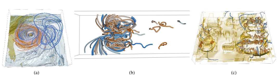
Figure 8: Examples showing the sketching of similar streamlines with different tolerance. More similar streamlines are orange and less similar ones are blue. The corresponding patterns sketched for (a)-(c) are the circular, curly, and spiral patterns, respectively. 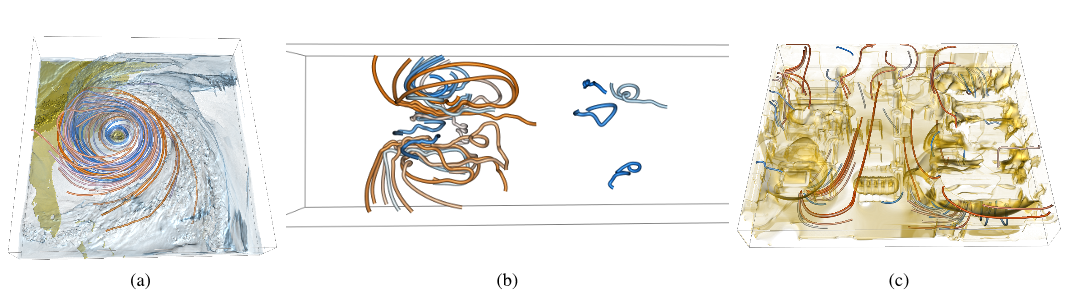
Figure 7: Examples showing the sketching of similar streamlines with different scales. large-scale streamlines are orange and small-scale ones are blue. The corresponding patterns sketched for (a)-(c) are the circular, curly, and long-tail patterns, respectively. 
Figure 2: Examples of the sign on curvature. In (a), the first four points (from left to right) have the positive sign while the rest three points have the negative sign. In (b), all points have the positive sign. 
Figure 9: (a)-(c) show the simultaneous display of multiple clusters derived from the sketch-based clustering. Each cluster is illustrated with a different color. A selective subset of streamlines is displayed for each cluster. Compared with the corresponding images in Figure 4, this visualization shows a much clearer picture of the flow patterns. 
Figure 3: Sampling points on two different curves yields the same feature vector since in (a), the corner is not sampled. Taking into account the accumulated curvature can capture the difference between the two curves. 
Figure 4: (a)-(c) show streamlines traced in the hurricane, plume, and computer room data sets, respectively. The velocity magnitudes are mapped to the streamline colors. For the hurricane and computer room data sets, the scalar fields are also volume rendered to provide the context information.


02 Mar 2010-